 |
|
|
|
|
|
|
|
|
|
|
|
|
|
 |
 |
 |
 |
 |
 |
 |
 |
 |
 |
 |
 |
 |
|
Session 17 (29 September 2015)
Depth and Shadow
Drawing and painting is usually a translation of a 3-dimensional
scene onto a 2-dimensional surface.
Creating space and a feeling of depth takes practice, but when it works,
it can be very rewarding.
In this session, class were asked to use pencil, paint, charcoal, or pastels,
with the added stipulation that only two colours or tones should be used
for the first hour. After this, new drawings could be undertaken, or another
colour could be added.

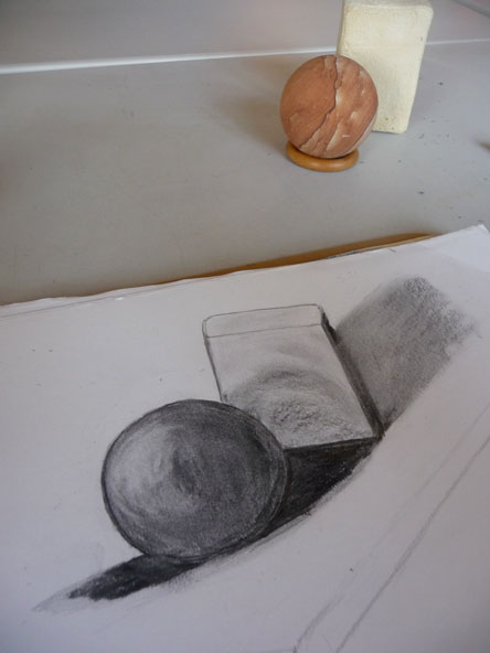
(Photographed
at a slightly jaunty angle to include the objects)
Top
Sue
Sue began with just two colours, before later adding black. Initially,
separation between the bottle and the pear wasn't very well defined,
but with some tweaking of the shadow areas and sharpening of the pear's
line, separation and a feeling of depth started to work well. For a
time, the pear's skin appeared to be quite glass-like - similar in render
to the bottle. However, after a bit more blending of her marks and some
additional work in the shadow areas, the picture really began to come
alive.
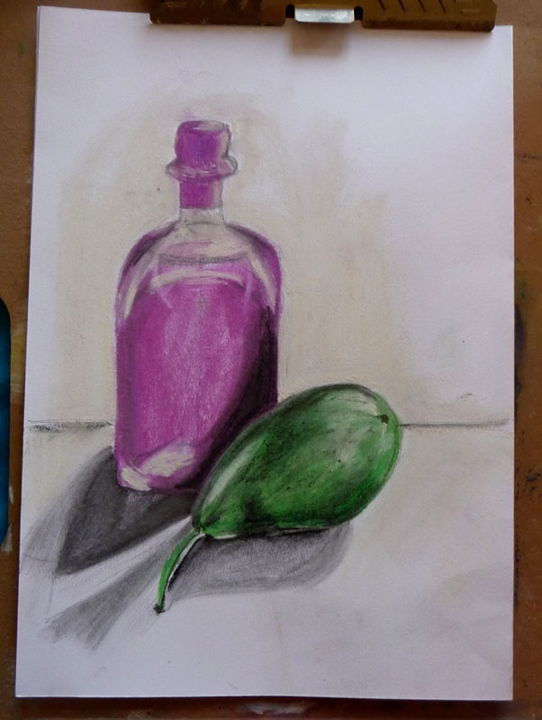
(Click
on image to enlarge).
Top
Ann
Ann really impressed me this week, with her determination to stick with
her drawing - starting with pencil and then later, moving to charcoal,
after it became apparent that her use of pencil was not encouraging her
to really work into the surface of the paper with any great depth. The
photographs shown here were taken before the surrounding shadow had been
blended to create a more graded and softer, natural effect, but the spatial
positions of her objects are certainly beginning to stand out.
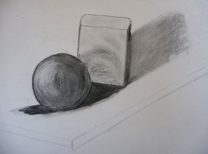
(Click
on image to enlarge)
Janet
Janet used two objects and two colours (until later adding white). Because
of the closeness of the density of colour and tonal range, the objects
were difficult for her to separate. However, there are some nice qualities
of shading on the woman's arm and the dog's head and front of body areas,
which are beginning to give the objects more 3-D form.
Darkening the shadow areas immediately around the dog, perhaps with a
little grey, would probably help the separation at this stage of the drawing.
Alternatively, removing some of the colour from the dress (behind the
front of the dog and around its head) by gently lifting with a rubber
- might help the separation and feeling of space. The stronger and more
dense yellow of the dog's head (as is) would then be left to appear more
stark against a lighter background.
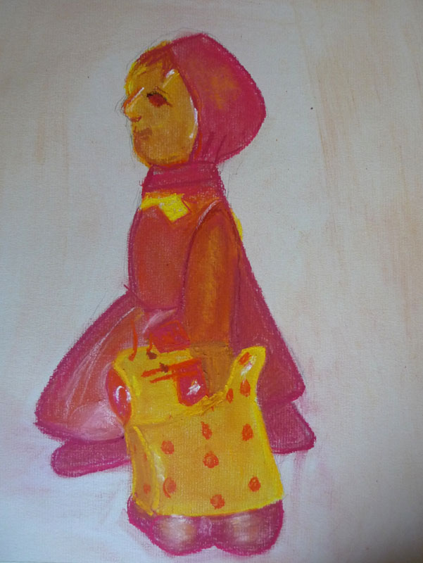
(Click on image to enlarge)

Michelle
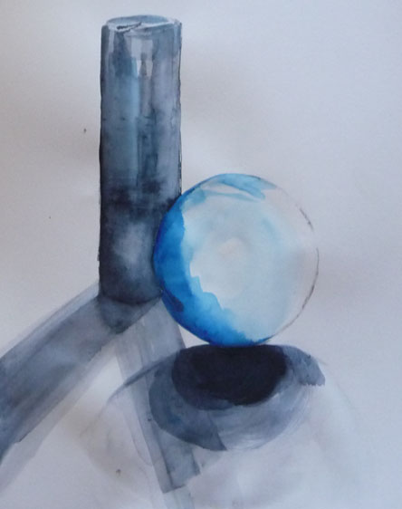
Michelle would probably have preferred not to have had this picture showing, as she struggled with paint being too wet and working on regular drawing paper. (I believe her intention had been to use pencil and therefore didn't have both of her sketchbooks with her). Having said this, she has created some very nice qualities in the cylindrical object and with a sharper line edge to the sphere, could probably have achieved the depth separation she was looking for. Blending the shadow areas to gradually fade into the table area would also have helped with attaining the desired effect.
Top
Linda
Linda's use of coloured paper, together with her choice of pastels, has produced quite an engaging drawing. Depth and separation proved a challenge, but by pressing the pastel harder when shading the shadow areas, she has started to lift and release form from its background.

(The bears fell over and lost position a few times, so we will forgive some of the mixed size proportions).
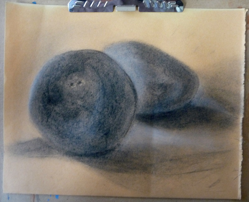
Pat began her drawing quite tentatively, but like Linda, selected a coloured paper which has worked well with her subject. Initially, the tone and density of both stones was identical and this prevented the feeling of both depth and separation. However, with perseverance and a mixture of adding and then removing and then adding again, the forms began to move apart. Once this had been achieved, attention was given to the surface textures and Linda has produced a very competent drawing that really reflects both the surface feel and weight of the stones.
(Click on image to enlarge)