 |
|
|
|
|
|
|
|
|
|
|
|
|
|
 |
 |
 |
 |
 |
 |
 |
 |
 |
 |
 |
 |
 |
|
 |
|
|
|
|
|
|
 |
 |
 |
 |
 |
 |
|

Thursday Art group - Session 13
< back | Session Menu | Session 13 - Gouache |
In this session we painted with gouache. In recent years, acrylic paint has become the preferred painting medium, for many artists, along with watercolour and oil painting. However, gouche still has a place in the artist's toolkit.
Some of the qualities of gouache include: Good opacity, reactivation with water after drying, can be used with watercolour paints.
Some
of the things to note: Gouache colours usually dry darker (or sometimes
lighter) than they appear when applied wet and paintings can sometimes
become a bit 'muddy' in appearance. Thicker applications, particularly
when used on canvas, can crack in a reticulated fashion when dry or over
prolonged time.
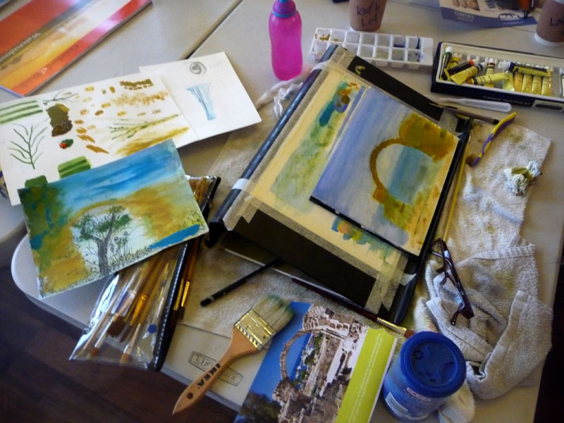
Kathy carried out a few experiments before focusing her attention on the arch image. (Click on image to see more).
Top
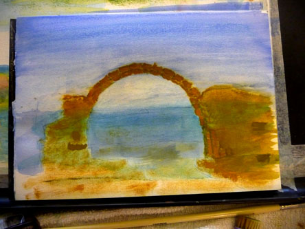
As
Kathy continued with her arch paintings, enjoying the ability to apply
detail using the gouache paint, more focus was placed on shapes than reproducing
colours from her photograph. We discussed laying in the background sky,
before continuing with the foreground, and this helped to avoid trying
to paint the sky around the arch later.
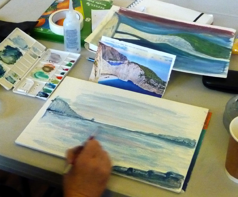
Lorraine
tried a few experiments to get a feel for the medium before embarking
on her seascape. (Click on image to see more).
Top

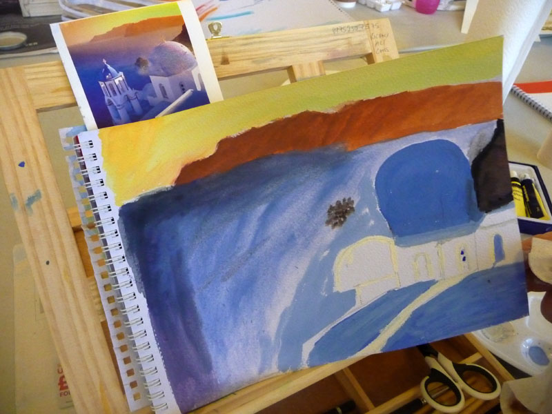
Nan experimented with laying colour down in bands, testing its
opacity and transparency. (Mouseover and also click on image to see more).
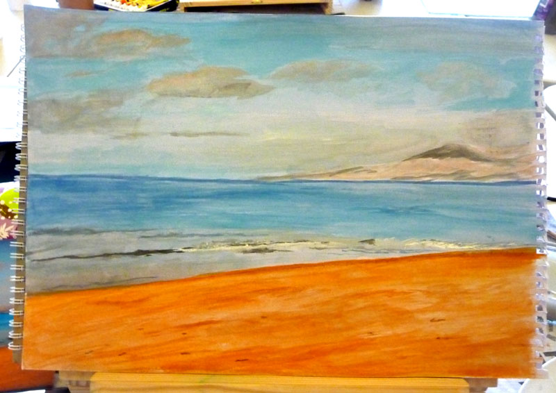
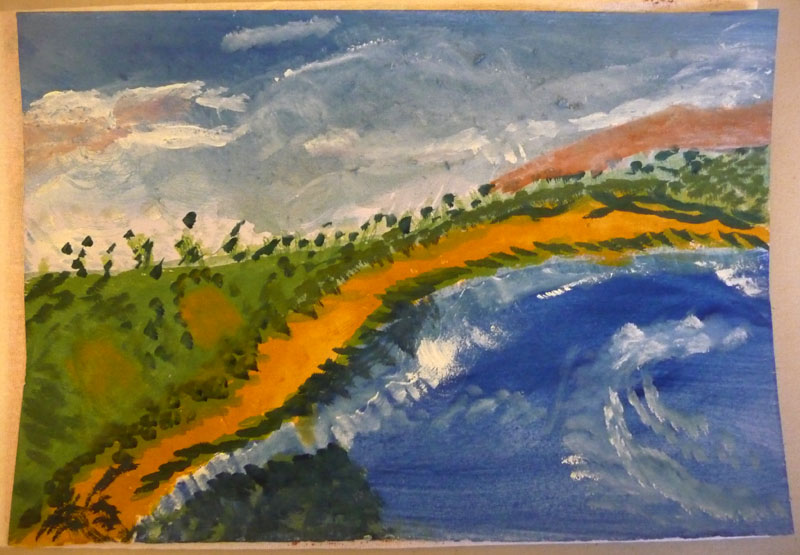
Mags painted he main scene shapes and colours and then began to consider the clouds and how to capture their light and dark areas and shapes. We discussed the direction of brush marks and took advantage of the opacity of the gouache to over-paint some areas. (Click on image to see more).
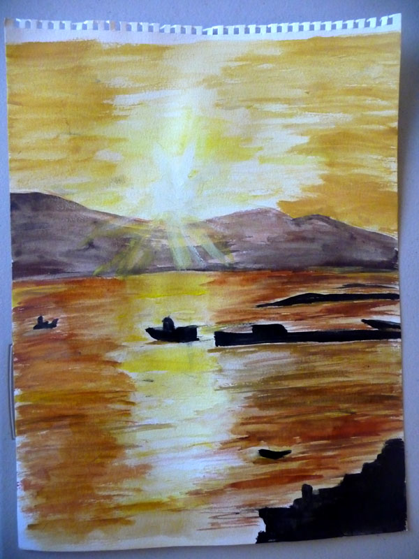
Rebecca impressed me with this first go with gouache, managing to capture the quality and feel of her subject. We discussed smoothing and softening some of the brush stroke marks and you can see how this began to affect the water in the far distance. (Click on image to enlarge).
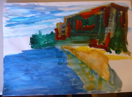
Rebecca's second painting seems to have lost its way a bit, although the thicker application of paint in the building is producing some nice qualities of abstraction. We discussed the reflection of the rock in the calm sea and how glazing smooth washes over the reflection would help to both flatten the sea and achieve the feel of depth and reflection.
(Left) Vee has captured a tranquil scene, aided by the smooth application of her colours. What appear to be breaking waves are nicely executed, as too are some of the clouds and sky.
(Click on image to enlarge).
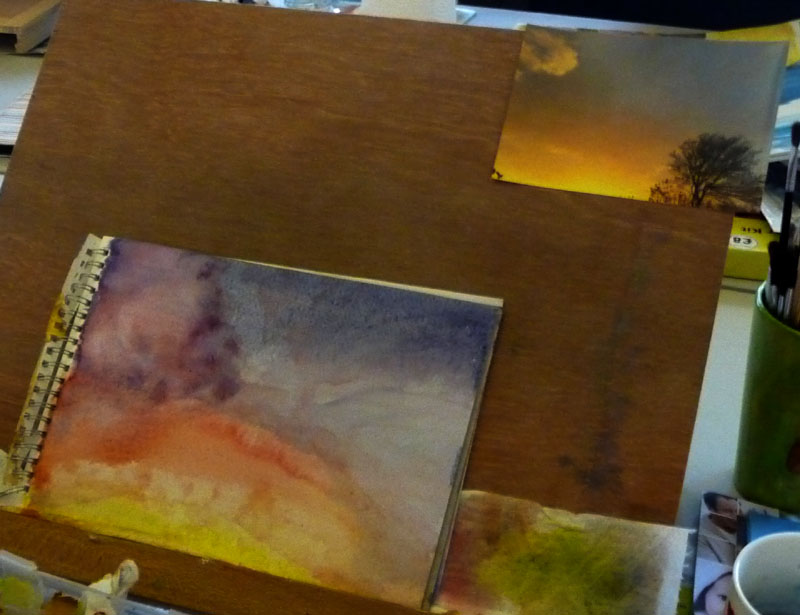
Tracy admitted to struggling a bit at the beginning of the session. Part of the difficulty seemed to be the overwhelming task of covering an A3 sheet of paper - so we discussed starting out a bit smaller. Next, studying the colours in her photograph, mixing to match as closely as possible before application, and then delineating the main areas, helped to cover the page in preparation for the later over-painting of detail areas. (Click on image to enlarge).
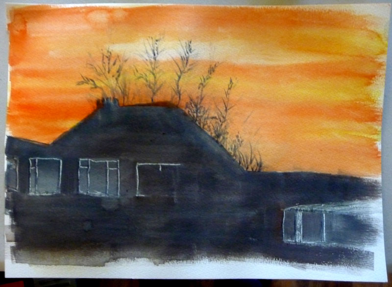
Stan captured the stark contrast of sun and silhouette in this picture. In the early stages, the plant growth was rather heavy and coarse, but some over-painting and reapplication has really improved the feel of the painting. Detail in the window frames works well, but we later discussed ways to brace the hand to reduce hand shake being transmitted through the brush. (Click on image to enlarge).
Techniques
discussed
Consideration for the nature of the paint - its opacity and tendency to
dry darker.
Reactivating
dried areas of paint with water.
Wetting painted areas with hard edges and then pulling the pigment around
with the brush to soften or remix.
Using water washing and cloth dabbing to remove pigment and lighten over-dark
applications.
Suggestions
and observations
It took a while for people to adapt their painting technique from watercolour
to gouache - and many began by applying the paint a bit too thinly.
However, as time went on, most said they enjoyed working with the gouache.
Learning to mix colour is something for people to further develop. Knowing,
not only what colours can be observed in the subject, but also understanding
which combinations of pigment can be used to reproduce the colours desired.