 |
|
|
|
|
|
|
|
|
|
|
|
|
|
 |
 |
 |
 |
 |
 |
 |
 |
 |
 |
 |
 |
 |
|
 |
|
|
|
|
|
|
 |
 |
 |
 |
 |
 |
|

Thursday Art group - Session 38
Session Menu | Session 38 - Monochrome Painting |
Monochrome Painting
This week we experimented with monochrome painting. We began with a short slide show (see below) of some examples and a little bit of background on the first recorded exhibiting, in the 'Incoherent arts' exhibition of 1882 in Paris, of a black painting by Paul Bilhaud. In more modern times, monochrome was at the heart of Suprematism and Constructivism - beginning in Moscow, with a Suprematist Composition: 'White on White' by artist, Kazimir Malevich.
Artists have used monochrome painting in the examination of values changing across a surface, expression of texture and emotions, intentions and meanings.
For our class, painting with only one colour removes the distractions of colour mixing and encourages visual changes through manipulating a single pigment, neat and variously diluted, to expand the range of possibilities.
Throughout the first three quarters of the session, everyone was asked to use one colour of paint and to apply it immediately, without first sketching in pencil. During the last half hour, black or white was allowed to be introduced to the painting.
Elizabeth
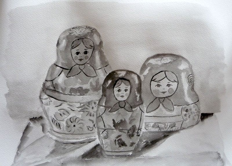
Elizabeth has handled her paint with sensitivity and managed to capture
the smooth and rounded feel of her subjects. An excellent piece of monochrome
painting.
(Click
on image to view and enlarge final painting)

Kathy
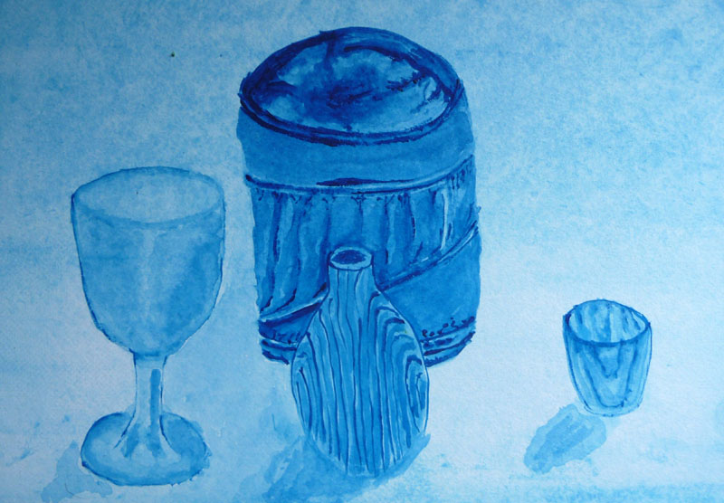
Kathy really took to this way of painting and produced some fine and detailed
work.
Her wine glass is beautifully rendered around the stem and her fine brushwork,
on the small wooden object, follows and enhances its form. The heavier
painting of the fabric covered box, mirrors its softer and pressable surfaces
- although it has to be said, that knowing the objects being viewed, does
offer additional clarity when viewing the final painting.
The little stainless steel pot seems to have thrown up a challenge and
appears more glasslike than metal. Perhaps, darker paintwork on its inner
surface might have helped here. The background wash ties everything together
and foreground shadows hold the objects on the table surface.
(Click
on image to view clearly)
Kathy started another painting (I think it's of a plastic bottle) and
has started to capture the plastic feel through her downward brush strokes.
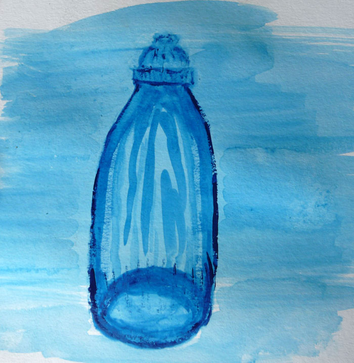
(Click on image to enlarge)
Tracy

Tracy has produced a a very fine monochrome painting, managing to get
balances of detail, form, transparency and reflection. It's easy to tell
what each of the objects is made from and they rest firmly on their fabric
surface.
(Click on image to enlarge)
Top
Helen

Helen
produced an excellent first painting, despite the slight handicap of working
on regular drawing paper. The proportions are mostly good in relation
to one another and the observation of light, dark, and reflective areas
is helping to give three-dimensional form to the objects.
(Mouse over image to change and click to enlarge)
Lorraine
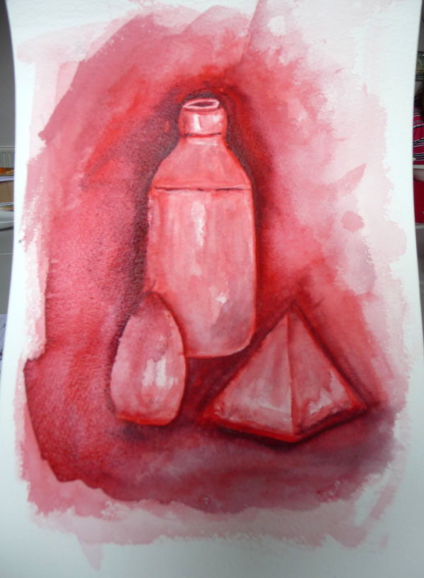
Lorraine began with a background wash and then gradually added density
to the darker areas. For a while, the objects remained quite flat, but
as the painting evolved, the bottle in particular, has started to take
on some three-dimensional form - helped by the light areas of reflected
light.
The addition of a dark grey in the final painting has increased the
feeling of the objects set in their fabric backdrop.
(Click
on image to view and enlarge final painting)
Mags
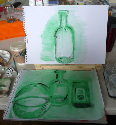
Mags was quickly in her element with this task and produced a couple
of convincing monochrome paintings with clearly discernible objects.
Her first painting is shown below her second (above) but in both, a
sketchy outline of forms, mixed with washes and later, denser application
of pigment in just a few areas, works extremely well.
(Click
on each image to enlarge separately)
Top
Stan
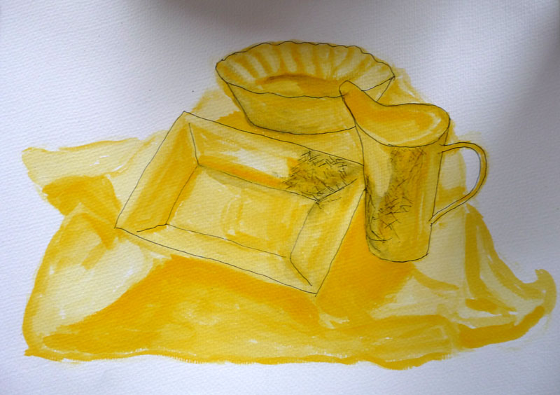
Stan
has never been one to shirk a challenge and
choosing yellow was a brave first choice of colour, since it's quite
pale and not always easy to see detail. However, the layering of the
colour and his observation of light and dark areas is beginning to work
well. With the later introduction of his black lines, the objects take
on a new life with sharpened edges. Although the plate in the foreground
slopes rather more in the painting than it does in the actual arrangement,
this adds a bit of quirkiness to the composition.
John
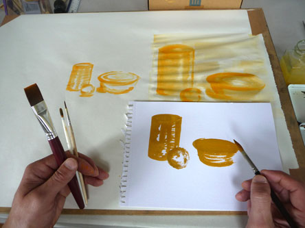
After some initial work with fine brushes on regular drawing paper,
John tried out some larger brushes and watercolour paper. This enabled
him to apply thicker areas of paint and the result from this, shown
particularly on the top lip of the bottom right-hand pot, is excellent.
With the later addition of white paint to enhance the light areas, John
brings more three-dimensional form to his objects and the delicate touches
on the sphere and the bowl work well.
(Click on top and bottom images to see separate enlargements)
Observations
This session seemed to go well and everyone followed the brief.